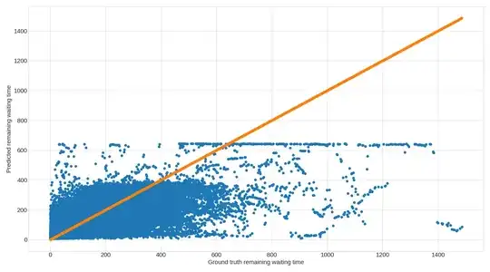
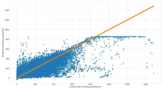
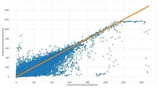
I have trained a RNN, GRU, and LSTM on the same dataset, and looking at their respective predictions I have observed, that they all display an upper limit on the value they can predict. I have attached a graph for each of the models, which shows the upper limit quite clearly. Each dot is a prediction, and the orange graph is simply there to illustrate the ground truth (i.e. ground truth on both axis).


 My dataset is split in 60% for training, 20% for test, and 20% for validation and then each of the splits are shuffled. The split/shuffle is the same for all three models, so each model uses the exact same split/shuffle of data for its predictions too. The models are quite simple (2 layers, nothing fancy going on). I have used grid search to find the most optimal hyperparameters for each model. Each model is fed 20 consecutive inputs (a vector of features, e.g. coordinates, waiting time, etc) and produces a single number as output which is the expected remaining waiting time.
I know this setup strongly favours LSTM and GRU over RNN, and the accuracy of the predictions definitively shows this too.
However, my question is why do each model display an upper limit on its predictions? And why does it seem like such a hard limit?
I cannot wrap my head around what the cause of this is, and so I am not able to determine whether it has anything to do with the models used, how they are trained, or if it is related to the data. Any and all help is very much appreciated!
Hyperparameters for the models are:
RNN: 128 units pr layer, batch size of 512, tanh activation function
GRU: 256 units pr layer, batch size of 512, sigmoid activation function
LSTM: 256 units pr layer, batch size of 256, sigmoid activation function
All models have 2 layers with a dropout in between (with probability rate 0.2), use a learning rate of $10^{-5}$, and are trained over 200 epochs with early stopping with a patience of 10. All models use SGD with a momentum of 0.8 , no nesterov and 0.0 decay. Everything is implemented using Tensorflow 2.0 and Python 3.7. I am happy to share the code used for each model if relevant.
EDIT 1 I should point out the graphs are made up of 463.597 individual data points, most of which are placed very near the orange line of each graph. In fact, for each of the three models, of the 463.597 data points, the number of data points within 30 seconds of the orange line is:
RNN: 327.206 data points
LSTM: 346.601 data points
GRU: 336.399 data points
In other words, the upper limit on predictions shown on each graph consists of quite a small number of samples compared to the rest of the graph.
EDIT 2
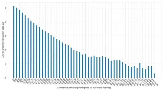
In response to Sammy's comment I have added a graph showing the distribution of all predictions in 30 second intervals. The y-axis represents the base 10 logarithm of the number of samples which fall into a given 30 second interval (the x-axis). The first interval ([0;29]) consists of approximately 140.000 predicted values, out of the roughly 460.000 total number of predicted values.
