I am mapping rather complex data into what essentially amounts to a greyscale image to take better advantage of GANs for generative means. Here is an example of some real data:

All real data is of the same shape (108 across x 12 high), with an enforced border region of two pixels along each edge - so the actual data is captured by the central 104x8 pixel data. There is significant coupling between individual pixels, so I applied a CNN in the network to try and learn these dependencies, with unequal kernels because the image is rectangular. A rough description for each row of pixels is as follows (note that each row is normalised between 0 and 1 for the network, with 0 corresponding to border region):
- Integer values -1 -1 -1 -2 -1 -1 -1 -2... etc.
- Very small float values (~0.03) with a break in the middle (~0.7)
- Integer values -2 -2 -3 -3 -2 -2 -3 -3...
- Float values
- Integer values -3 -4 -4 -4 -3 -4 -4 -4 -3...
- Float values
- Integer values (one hot of 24, moving in blocks of 4)
- Integer values (one hot of 4, repeating in blocks of 4)
I have applied the WGAN network with gradient penalty implemented in PyTorch. The general generator network has this architecture:
- ConvTranspose2d
- LeakyReLU(0.2)
- BatchNorm2d
With a sigmoid at the end. The critic looks like:
- Conv2d
- InstanceNorm2d
- LeakyReLU(0.2)
With no activation at the end of the critic. I have a dataset size of 1795, sadly I don't really have any conventional means to increase this. I train the critic for 5 rounds for each round of generator training. After 900 epochs, an example of the generated output is as follows:
So looks quite close, but converting this back into the actual form of my data results in some weird results because of the variation in pixels along the float rows. There are also some weird bits on the side (it doesn't seem to have properly learnt the border). The first few pixels in the rows are also unusual in the real data, with the first few for some of the rows basically being a border region - this behaviour seems to have been learnt for some rows (e.g. row 5), but not others. This may be because of my unequal kernels, I'm not sure.
Some current improvements I'm considering are to add gaussian noise to the data (this may help as it removes the integer aspect of some pixels), augment the training set both with noise and with conventional methods such as rotating the image 180 degrees, adding extra border regions and translating the images etc.. If anyone has any insight into how I can further improve output I would really appreciate it. This image is actually a simplification of the dataset, and eventually, I want to have less regular sequencing in the pixels. Thanks!
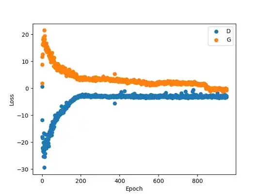
(Edit) Here is an image of the critic (D) vs generator (G) loss over the 900 epochs used to generate the fake data:

