In addition to the steps in the question for making the overall app theme dark, one must apply a theme within the ebook viewer. Here's how to do that:
Save the default theme
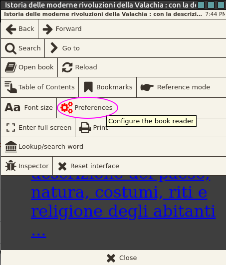
- Open an ebook (any ebook).
- Click on the Settings icon (screwdriver and spanner icon depending on your version) on the bottom left.
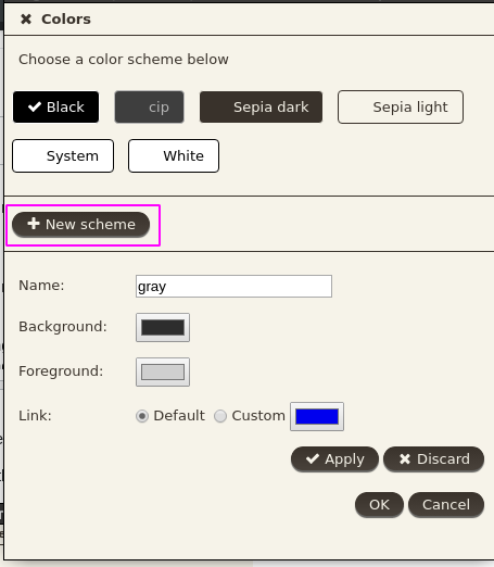
- Open Theming Tab and Save the theme by a your name of choice.
Create the Dark theme
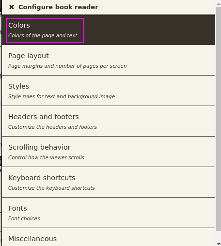
- Open the User Stylesheet Tab
- Paste the Solarised Dark theme CSS code at the bottom of this answer. Sourced from saucemcboss' Github Repo.
- Open Theming Tab and Save the new theme by a your name of choice.
This way it will apply to all your ebooks, together with the app's theme. You can switch between the default and Dark theme from the Theming tab's Load button.
CSS:
article,
aside,
details,
figcaption,
figure,
footer,
header,
hgroup,
nav,
section,
summary {
  display: block;
}
audio,
canvas,
video {
  display: inline-block;
}
audio:not([controls]) {
  display: none;
  height: 0;
}
[hidden] {
  display: none;
}
html {
  font-family: sans-serif;
  -webkit-text-size-adjust: 100%;
  -ms-text-size-adjust: 100%;
}
body {
  margin: 0;
}
a:focus {
  outline: thin dotted;
}
a:active,
a:hover {
  outline: 0;
}
h1 {
  font-size: 2em;
}
abbr[title] {
  border-bottom: 1px dotted;
}
b,
strong {
  font-weight: bold;
}
dfn {
  font-style: italic;
}
mark {
  background: #ff0;
  color: #000;
}
code,
kbd,
pre,
samp {
  font-family: monospace, serif;
  font-size: 1em;
}
pre {
  white-space: pre-wrap;
  word-wrap: break-word;
}
q {
  quotes: "\201C" "\201D" "\2018" "\2019";
}
small {
  font-size: 80%;
}
sub,
sup {
  font-size: 75%;
  line-height: 0;
  position: relative;
  vertical-align: baseline;
}
sup {
  top: -0.5em;
}
sub {
  bottom: -0.25em;
}
img {
  border: 0;
}
svg:not(:root) {
  overflow: hidden;
}
figure {
  margin: 0;
}
fieldset {
  border: 1px solid #c0c0c0;
  margin: 0 2px;
  padding: 0.35em 0.625em 0.75em;
}
legend {
  border: 0;
  padding: 0;
}
button,
input,
select,
textarea {
  font-family: inherit;
  font-size: 100%;
  margin: 0;
}
button,
input {
  line-height: normal;
}
button,
html input[type="button"],
input[type="reset"],
input[type="submit"] {
  -webkit-appearance: button;
  cursor: pointer;
}
button[disabled],
input[disabled] {
  cursor: default;
}
input[type="checkbox"],
input[type="radio"] {
  box-sizing: border-box;
  padding: 0;
}
input[type="search"] {
  -webkit-appearance: textfield;
  -moz-box-sizing: content-box;
  -webkit-box-sizing: content-box;
  box-sizing: content-box;
}
input[type="search"]::-webkit-search-cancel-button,
input[type="search"]::-webkit-search-decoration {
  -webkit-appearance: none;
}
button::-moz-focus-inner,
input::-moz-focus-inner {
  border: 0;
  padding: 0;
}
textarea {
  overflow: auto;
  vertical-align: top;
}
table {
  border-collapse: collapse;
  border-spacing: 0;
}
html {
  font-family: 'PT Sans', sans-serif;
}
pre,
code {
  font-family: 'Inconsolata', sans-serif;
}
h1,
h2,
h3,
h4,
h5,
h6 {
  font-family: 'PT Sans Narrow', sans-serif;
  font-weight: 700;
}
html {
  background-color: #073642;
  color: #839496;
}
body {
  background-color: #002b36;
  margin: 0 auto;
  max-width: 23cm;
  border: 1pt solid #586e75;
  padding: 1em;
}
code {
  background-color: #073642;
  padding: 2px;
}
a {
  color: #b58900;
}
a:visited {
  color: #cb4b16;
}
a:hover {
  color: #cb4b16;
}
h1 {
  color: #d33682;
}
h2,
h3,
h4,
h5,
h6 {
  color: #859900;
}
pre {
  background-color: #002b36;
  color: #839496;
  border: 1pt solid #586e75;
  padding: 1em;
  box-shadow: 5pt 5pt 8pt #073642;
}
pre code {
  background-color: #002b36;
}
h1 {
  font-size: 2.8em;
}
h2 {
  font-size: 2.4em;
}
h3 {
  font-size: 1.8em;
}
h4 {
  font-size: 1.4em;
}
h5 {
  font-size: 1.3em;
}
h6 {
  font-size: 1.15em;
}
.tag {
  background-color: #073642;
  color: #d33682;
  padding: 0 0.2em;
}
.todo,
.next,
.done {
  color: #002b36;
  background-color: #dc322f;
  padding: 0 0.2em;
}
.tag {
  -webkit-border-radius: 0.35em;
  -moz-border-radius: 0.35em;
  border-radius: 0.35em;
}
.TODO {
  -webkit-border-radius: 0.2em;
  -moz-border-radius: 0.2em;
  border-radius: 0.2em;
  background-color: #2aa198;
}
.NEXT {
  -webkit-border-radius: 0.2em;
  -moz-border-radius: 0.2em;
  border-radius: 0.2em;
  background-color: #268bd2;
}
.ACTIVE {
  -webkit-border-radius: 0.2em;
  -moz-border-radius: 0.2em;
  border-radius: 0.2em;
  background-color: #268bd2;
}
.DONE {
  -webkit-border-radius: 0.2em;
  -moz-border-radius: 0.2em;
  border-radius: 0.2em;
  background-color: #859900;
}
.WAITING {
  -webkit-border-radius: 0.2em;
  -moz-border-radius: 0.2em;
  border-radius: 0.2em;
  background-color: #cb4b16;
}
.HOLD {
  -webkit-border-radius: 0.2em;
  -moz-border-radius: 0.2em;
  border-radius: 0.2em;
  background-color: #d33682;
}
.NOTE {
  -webkit-border-radius: 0.2em;
  -moz-border-radius: 0.2em;
  border-radius: 0.2em;
  background-color: #d33682;
}
.CANCELLED {
  -webkit-border-radius: 0.2em;
  -moz-border-radius: 0.2em;
  border-radius: 0.2em;
  background-color: #859900;
}
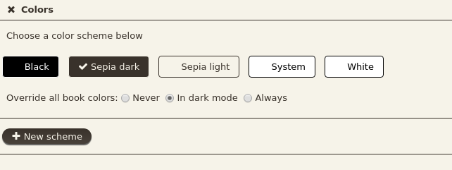
export CALIBRE_USE_DARK_PALETTE=1for the dark GUI in Calibre main, as said in comment by @meskobalazs. For the viewer, colors can be now changed from settings, so I have posted a new answer. – cipricus Mar 15 '20 at 20:52